Friday, February 12, 2010

MS: A Painter's World


Tommy


Amelia


Robbie


Ella

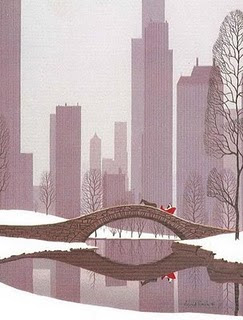
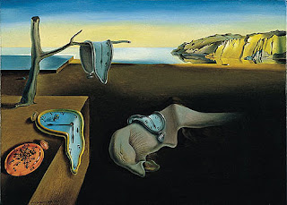
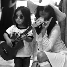
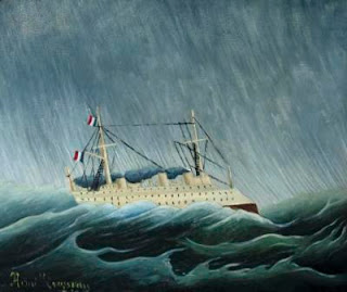
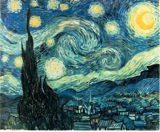
Middle school work at last! This is a project I designed during my student teaching at RISD. The goal for this lesson was to study a painting and recreate it in a three-dimensional model, applying the artists' painting technique and color palette. It was also to understand scale and construct models. We first looked at a slideshow of different landscape paintings and analyzed them using elements and principles of design while also answering a worksheet that required students to look closely at their piece. Students then cut out the main features of their painting out of paper, traced them onto illustration board, and cut them out with x-acto knives. Before painting their model, students practiced painting certain elements separately and then painted their final boards with acrylic. They all came out am-az-ing! I was also happy to find out that a RISD professor has been assigning this project every year with the foundation students. It's a great way for students to expand their painting skills.

Wednesday, February 10, 2010

Chinese Gate Gods plus New Year Celebration Pics

Lanterns and dragons

Posing with Emma and Desiree

Gate god protecting the UE door from evil spirits


Students collaborating

It is Chinese custom to place a print of a gate god on the front of your home or temple to ward off evil spirits. This week, every UE class collaborated on three different drawings of gate gods in preparation for the Chinese New Year. Before dividing students into three groups, we talked about what it meant to work as a team and how important it was that we respected everyone's ideas and feelings. It was inspiring to see students compromise with each other and I'm so proud of how well these turned out!

Tuesday, February 9, 2010

LE: Let Them Eat Cake

Cooper

Joseph

Jack

Max

Wayne Thiebaud's Cakes painting was used to teach students how to draw three-dimensional cylinders. They first correctly guessed that the repetition of cakes was supposed to be a commentary on popular culture. Then we sketched out a single cake and made it look round and voluminous by adding shading on the cake and table. For the final, they designed a delicious cake they would sell at their own bakery and colored it in oil pastel. Bon appetite!

Tuesday, February 2, 2010

LE: Kimonos

Stefy

Nick

Max

I wanted to expose students to different painting techniques that went beyond the paintbrush. I was drooling over Eric Carle collages and thought it might be interesting to use the same technique for fashion. Kimonos, in my opinion, are the most beautiful garment that anyone can wear. So. I gave a brief cultural lesson on kimonos and students created their design Eric Carle style, by using different tools like sponges, forks, and q-tips to add texture and then gluing the kimono and obi (sash) together. I really want to wear these!