Friday, April 30, 2010

LE: Planet Prints


Zac R

John

Xavier

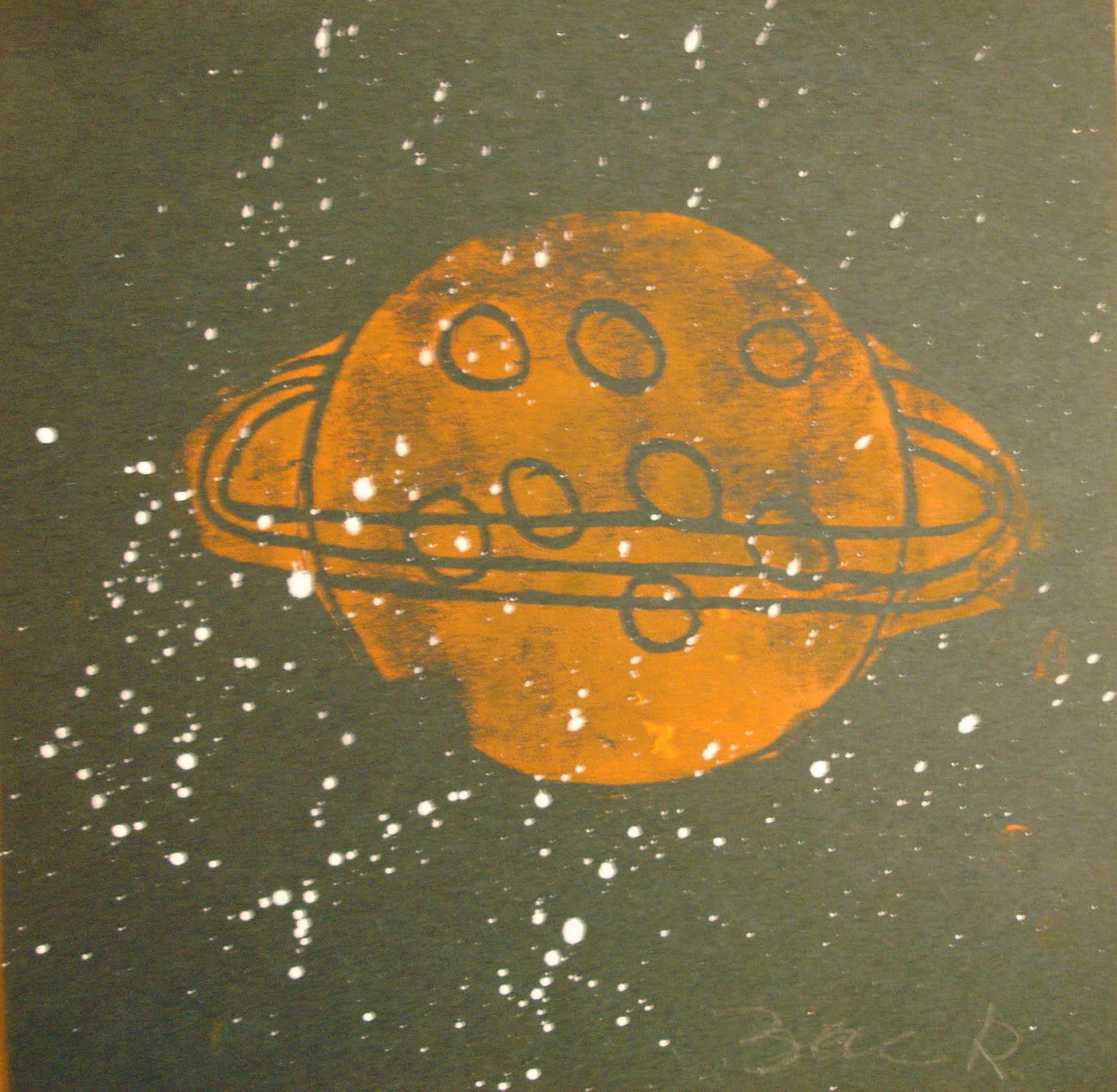
LE's theme this year is space. As a way to make their planet reports more visually exciting, they incorporated illustrations of all the planets into their reports using various media. For these prints, students carved their planet on a styrofoam sheet using visual references to inform the surface design, and stamped it on black paper. As an option, they flicked white paint to add a starry effect. When students were done, they glued their illustrations and text in an accordion fold book and designed covers out of poster board. The top photo shows the finished products, which Jennie displayed beautifully for their space presentation.

MS: Word Portraits

Tommy

Daniel

Amelia

Robbie

Middle school students drew their self-portraits made of words that reflected their identity. We first looked at how different artists used symbols, color, or mark making to communicate a message about themselves. Then we focused on John Sokol, an artist who draws famous people out of their own words. We discussed how text, whether it's a book we read, a poem we write, or lyrics we listen to, can reflect who we are. Students laid tracing paper on top of their photographs and gave their portraits form with carefully chosen text (a brilliant idea from Megan Ellis who did this project with Hope high school students!). To give the portraits dimension, students divided a strip of paper into thirds and practiced going from the darkest value to the lightest value, layering text for the darks and using little to no text for the lightest. They really didn't need my help after this point. I am so impressed by their drawing skills and personal investment in their work. I heart all of them!


Tuesday, April 27, 2010

LE: Impression of Light

Stefy

Nathan

Miles

Max

Last week, students learned how to draw light from the Impressionists. It was good timing for this lesson because many of them were involved in building a kayak with Margery and were excited about drawing Renoir's boats. They looked at paintings by Renoir and Monet and identified how the artists showed sunlight through layered colors and thick dabs of paint for the reflection. After, we drew the image together as a class. Techniques that they learned were layering colors to show depth and applying strokes in one direction to show the light from the sun.

Thursday, April 22, 2010

UE: Painting with Scissors

Hannah

Max

Sofia

Logan

Palmer

This week students have been designing dynamic compositions inspired by Henri Matisse's paper cut-outs. What I love about his work is the energy and rhythm that he captures through his organic shapes dancing across geometric landscapes. He called them "painting with scissors". The goal for this lesson was for students to understand how to make a strong composition. They first analyzed how Matisse achieved balance and movement in his paintings and then made color swatches out of tempera paint. When they dried, they cut out organic shapes from nature and arranged it in a way to make the eye travel across the picture.

Tuesday, April 13, 2010

Raffle Items


Lampshade design with UE1 wire portraits. They were arran
ged digitally and printed on a semi-transparent fabric.


MS students designed a Chinese Zodiac themed chess board. They made the characters out of clay and painted them with acrylic paint. I'm amazed at how well they turned out! The photos above only show in-progress work; I never got to document the final completed board.


Josef

Katie

Ella

Amelia

For the past couple of weeks, students and I, as well as other teachers and parents, have been collaborating on art items for our Top Hat raffle fundraiser. Each class did their own project. UE2 students painted portraits of themselves in the style of Amedeo Modigliani, a French artist who was known for his elongated and pensive faces. When they are complete, they'll be transferred to wooden coasters. We first discussed how Modigliani stylized his paintings with the abnormally yet elegant long necks and noses, their calm and tilted postures. I taught them how to mix a basic peach color that they adjusted to their own skin color. For the background, students mixed earthy tones like Modigliani's palette. I love how they're turning out!


One of LE's project was to make animal pillows. Students traced an animal stencil onto a fabric of their choice, cut them out, and designed the animals' features with buttons and other fabric. They needed a lot of help sewing, but thanks to the parents and Quest staff they turned out beautifully! Their other project was to decoupage wooden birdhouses out of tissue paper~ lovely:)

Friday, April 2, 2010

UE: Abstract Still Life

Brooke

Kata

Kevin

Jordan

I have heard of Cubism, but I've never heard of Orphism. I came upon Robert Delaunay's paintings recently and was drawn to his color palette and abstract shapes. I thought students could understand his work better in the context of Cubism, the greater movement that Orphism stemmed from. We first looked at Georges Braque's Woman and a Guitar and discussed characteristics of Cubism, such as intersecting planes, multiple viewpoints, and monochromatic colors. Then we looked at examples of Orphism and saw that they were abstract but much brighter and colorful. I thought this would be an interesting way of drawing a still life since it required students to perceive the objects from different angles. I set up different objects on each table that students drew. After, they divided the composition into several planes and visually pulled apart the object, looking at it from different perspectives and repeating elements of the shape. It was a fun variation from the standard still life.